A coworker of mine brought a puzzle into the staff lounge/dining area at work a few weeks ago. Since then a couple of us have worked on it on and off, and so far we've got...
…the frame, and a smattering of connected fragments. It's decidedly not an easy puzzle.
Yes, that's the picture on the puzzle.
Progress on this puzzle, since we completed the outside frame, is typically in the range of 0–2 connections made per person, per day. It's a thousand-piece puzzle, fifty pieces wide by twenty tall. Yesterday as I managed to get a connection more by chance than skill, I wondered just how many connections there were in the puzzle.
It's not a very difficult problem, once we realize that the puzzle pieces are arranged in an essentially regular rectangular grid. This allows us to simplify the problem immensely (in true physicist fashion) by imagining the puzzle as a matrix of \(m=50\) and \(n=20\). The problem thus becomes a question of how many “edges” there are between all the pieces of a regular matrix.
We can start to break the problem down by looking at special cases: first of all, there are four corner pieces, each of which have only two connections. Then, there are a number of edge pieces, each of which will have three connections. Finally, the remainder of the pieces are interior pieces which have four connections each.
If we call the length and height of the puzzle m and n, then the number of edge pieces is going to be \(2\cdot[(m-2)+(n-2)]\). (The picture below may help you picture the various areas involved; the edge pieces are the areas in green, the corners are blue.)
The number of interior pieces is simpler, it's simply \((m-2)\cdot(n-2)\). Now that we have the number of each type of piece, it's a simple matter to multiply them by the number of connections they have and divide by two since every connection is getting counted twice. This gives us a formula for a function:
\begin{align}f(m,n)&=\frac{1}{2}\Bigl[2\cdot4+3\cdot2\cdot\bigl[(m-2)+(n-2)\bigr]+4\cdot\bigl[(m-2)\cdot(n-2)\bigr]\Bigr]\\
&=\frac{1}{2}\Bigl[8+3(2m+2n-8)+4(mn-2m-2n+4)\Bigr]\\
&=\frac{1}{2}\bigl[8+6m+6n-24+4mn-8m-8n+16\bigr]\\
&=\frac{1}{2}[4mn-2m-2n]\\
&=2mn-(m+n)\end{align}
Phew! That's a lot friendlier looking. Funny, I remember when I used to hate algebra with a passion, but that was kinda fun. Absence really does make the heart grow fonder, I guess.
Anyway, we've got our function, but we should probably test it with easy cases. Let's take the cases where \(m=n=2\) and \(m=n=3\):
Here we have some (extremely simple) puzzles. For the first one, on the left, it's easy to see that there are four connections between the four pieces. Plugging 2 in for m and n in our function gives: \[f(2,2)=2\cdot2\cdot2-(2+2)=8-4=4\] So that works. The second puzzle is larger, but it's still easy to count twelve connections between the nine pieces. Plugging 3 in for m and n gives us: \[f(3,3)=2\cdot3\cdot3-(3+3)=18-6=12\] So it appears to hold water. Going back to the puzzle at work, which had \(m=50\) and \(n=20\), we have: \[f(50,20)=2\cdot50\cdot20-(50+20)=2000-70=1930\]Which is a lot of connections! Anyway, my curiosity is sated, and you now have a simple formula to use for party tricks or whatever in the future. A hui hou!
Two weeks ago my friend Graham and I took a trip out to Volcanoes National Park to see the Kīlauea lava lake. (This isn't the trip I posted about before, which didn't actually materialize.) We also stopped at a nearby bird sanctuary and took a neat drive up the side of Mauna Loa, though in pretty much reverse order to how I just listed things.
We spent forty-five minutes sitting in the line of cars waiting to get to the viewing overlook at the Jagger Museum so it was after sunset by the time we got there, the visibility not improved by a light drizzle. Due to that I'm afraid I wasn't able to get any pictures worth sharing, but thankfully Graham was a bit more prepared and managed to get some video with his DSLR. He'd also been two weeks earlier when the lava lake first rose into view and took footage then too, which I had the idea of compositing together to give a comparison of the activity levels at both times.
When we went the lake was a bit more active than it had been when he'd first gone, with one side constantly slowly boiling like a pot on the stove, periodically throwing a spray of incandescent rock into the air to fall as molten rain as giant bubbles of gas burst unceasingly from the depths of the earth. In the dark it's hard to get a sense of scale, but when you watch the video below keep in mind that that lava lake is eight acres in size. I've taken the footage from both trips and played them one after the other, sped up by 4x to keep the video shorter. (Apologies for the lack of sound; the original audio is just a babble of tourists and doesn't add anything so I muted it, and since this is pretty much my first video compositing experience I was more focused on getting it working than adding audio.)
Only a few days after this trip the lava lake level lowered to where it once again couldn't be seen from the overlook and so far as I know hasn't risen again, so it looks like I caught it just in time. Who knows, though, this is the apparently the first time it's been visible from the overlook in something like thirty years, so perhaps it indicates that the eruption activity center is moving back to the summit and away from the flank. Only time will tell.
Oh, I mentioned going on a scenic drive up the flank of Mauna Loa. The day was intermittently rainy and sunny, with rain clouds rolling in waves across the landscape, so while it was pretty it again wasn't very conducive to photography.
What was (surprisingly) conducive to photography were some of the birds we saw as we drove up. I was driving along on the one-lane road and noticed a solitary francolin standing on the left side of the road. It was standing on one leg in what looked like a fresh dirt-bath dirt patch, and continued to stand there as the car got closer…and closer…and closer, until I had pulled up directly beside it. It seemed completely unfazed as rolled down my window and sat staring at it in stupefaction, mere feet from where I sat.
(If I may digress; francolins are in the same family as chickens [though never domesticated], and I grew up around a lot of chickens. Other than chicks that were incubated and raised primarily around humans, I've never seen a chicken-like bird this unafraid of people, especially a wild one. I couldn't [and to a degree still can't] get over just how unruffled this bird was. I guess this must have been what it felt like landing on Mauritius and encountering the dodos for the first time.)
Anyway, after picking my jaw up off the floor, I was able to get some extreme close-ups of the francolin thanks to its complete coöperation, such as this one:
"What, never seen a francolin before?"
After what felt like a few minutes staring in wonder at this fearless bird as it stared dispassionately back, we left it where it was and continued up the road. Not much further we ran into a flock of five francolins in the process of slowly crossing the road, whom we interrupted just as they had a bird directly on each side of the road. Once again they weren't inclined to move even as we drove directly between them, mere feet away from a francolin on either side. Given the behavior of the francolins I've seen on Mauna Kea it was, frankly, a bit surreal. I don't know why these francolins so far up Mauna Loa are so fearless – perhaps the isolation and lack of experience with humans? – but it was a really amazing experience.
At the end of the road, about 6,000 feet up, one of the trails to the summit of Mauna Loa begins. It's a long hike, about three or four days, with cabins to stay at along the way. The end of the road also offered an amazing view down to Kīlauea caldera, which we were able to catch glimpses of in between the clouds rolling through. We also took a short hike to where some Mauna Loa silverswords had been planted as part of a reintroduction program. It was interesting to see the differences between them and their Mauna Kea brethren.
The Mauna Loa silverswords, as seen above, seem to have their leaves initially green only to turn silver later, while the Mauana Kea ones appear to be silver from the get-go. All the ones we saw were pretty small; that was one of the largest ones, and it's only about the size of a large cabbage. Of course, that may just be due to age differences between the two populations (both of them human-planted, coincidentally). The Mauna Loa silverswords, additionally, seemed to have only a single rosette, in contrast to the Mauna Kea ones that often have multiple rosettes in one plant. (I've heard this is the result of a genetic bottleneck; the single-rosette form is the standard, the multi-rosette is due to a mutation, but it just so happened that when they were collecting what few silverswords remained on Mauna Kea for breeding the few they got had this mutation so the ones that have been re-introduced do as well.)
Also between the drive and the volcano we stopped a bird sanctuary, which I don't have much to say about other than that it was a nice mile-long hike in the gathering dusk, trying to make out lots of little bird flitting about in the trees. And there were some neat kalij pheasants in the undergrowth that were pretty fearless around us too, though not quite to the extent the francolins were. All in all, a nice trip.
Later today I'll be taking a trip to Hawai‘i Volcanoes National Park to see the lava lake in Kīlauea caldera. In case you haven't heard: Kīlauea has had a lava lake in its summit caldera constantly since it began its current eruption on January 3, 1983, however, the level of the lake has fluctuated over time, and for most of its existence has been very low – too low for tourists to see from safety, and only visible with cameras set up on the very rim of the crater. Just recently, within the last two weeks, the level of the lake has risen dramatically, making it easily visible.
But wait – I'm using terms like caldera and crater willy-nilly here without definition. Kīlauea the volcano has a slightly complicated summit, and there are several names bandied about when talking about it. This post is as much for my sake as it is for yours, but I'm going to try to map out exactly where all the various names refer to. First of all, have a Google Maps view of the area:
This is a satellite photo of the area around the summit caldera of Kīlauea. This picture is mostly for reference. For actually pointing out the various parts, I've created the following picture with various regions colored in for clarity:
Here's the summit region again, with significant features colored it. Shown in red is Kīlauea Caldera. Calderas are a common feature at the summit of volcanoes, and are formed when the summit of a volcano collapses after a particularly strong eruption – the magma in the magma chamber has been erupted and can no longer provide support to the overlying rock. It's likely that Kīlauea Caldera was formed over several centuries, and may have attained its current form after a particularly violent eruption in 1790. I'm not 100% sure of these boundaries, as the walls of the caldera steadily diminish to the southwest where lave has spilled out, and there may be a small lobe to the northeast that I haven't included, but the outline is close enough.
The smaller green area within the caldera is Halema‘uma‘u Crater. (Remember my tips for pronouncing long Hawaiian words with reduplication! It's Hale·ma‘u·ma‘u.) Halema‘uma‘u Crater is a smaller pit crater within the larger caldera, and has been the location of most of the volcanic activity at the summit for quite a while (though not all of it; directly to the east of the caldera in the picture above you can see the pit of Kīlauea Iki where an eruption happened in 1959 that created some of the tallest lava fountains ever recorded).
Finally, within Halema‘uma‘u crater, colored in blue, is Overlook Crater, named for…I'm not really sure, actually. I guess the fact that it can be seen from the overlook at the nearby Thomas A. Jagger Museum. This is the actual volcanic vent, and has in the past taken the form of a yet smaller crater within Halema‘uma‘u crater. This is where the lava lake I talked about has actually been residing, usually far enough below the surface as to be unseen from the overlook.
However, starting on April 24th, the lava lake inside the vent rose almost to its lip (at the floor of Halema‘uma‘u crater), the highest it had ever come since the vent opened. As of April 29th the lava has actually risen enough to spill onto the crater floor, and has since fluctuated around the level of the floor of the crater floor. It's clearly visible from the overlook, and a lot of people are going out to take a look, including myself. If all goes well I hope to have some pictures of it soon, and with this post under your belt you'll be able to follow what I'm talking about when I casually throw out names like “Halema‘uma‘u crater.” A hui hou!
Edit: Well, maybe this'll teach me to announce things ahead of time. Turns out, due to unforeseen circumstances, several of the people I was planning on going with couldn't make it today, so we're postponing to a later date yet to be determined. I'll be sure to write about it when it does happen, though.
Today I'm going to talk about a game I've been playing for about a year now called Europa Universalis IV (or EU4 as I'll be abbreviating it for the rest of this post). EU4 is a game published by Paradox Interactive and created by their in-house studio Paradox Development Studio (PDS) and is what's known as a grand strategy game, which resembles your average strategy game in the same way that piloting the Space Shuttle resembles driving your car to the store. That is to say, it's a lot more complicated. This is not a game for the faint of heart, the short of patience, or the unwilling to learn.
That doesn't really explain what EU4 is, however. At its most basic, EU4 is no less than an ambitious simulation of history covering the time period from A.D. 1444 to 1821 down to a time resolution of a single day (that's 377 years, for those counting). This is the Age of Exploration, of the Reformation, the Renaissance, and the rise of the modern scientific method. It was a time of great global upheaval, with the (re)discovery of the New World and the great Columbian Exchange, of the eclipsing of long-standing overland trade routes between Asia and Europe by new and more profitable sea routes and the rise of modern economic systems. It was an era when national border were often in flux, and when the very concept of nation-states began to attain its modern form. Spain, Portugal, France, and England all formed vast colonies overseas, while enjoying unprecedented trade revenues at home due to the monumental advances in ship construction enabling the new oceanic trade routes. Old nations fell, while new ones were born, including the United States towards the end of this period. It was the time when Europe (western Europe, specifically) began to wield an influence far outstripping its relative geographical size, the effects of which are still very much with us nearly two hundred years later.
It was a very dynamic period in history, is what I'm trying to say, and an extraordinarily interesting one to poke and tweak and fiddle with in an attempt to see how history could have played out differently.
This is complemented by an absolutely beautiful map of the world on which the game plays out. Load up the game and you'll find yourself staring at this (as always, click for a bigger view; my desktop resolution is 1,920x1200 so screenshots get squished a bit):
For the full effect, have the gorgeous strains of the main menu theme playing while you read the rest of this post:
If you enjoyed that, you can listen to the full soundtrack here. By the way, in some of these screenshots, you may notice that coastlines look a bit wonky; that's because I'm playing on Linux and one of the recent patches messed things up slightly. Other than that minor graphical glitch and a known one that required me to disable dynamic shadows, I haven't had a single problem running the game.
(Future Edit! The coastlines glitch was fixed a few months later in a patch, and the shadows one apparently was too, though I didn't notice exactly when. Paradox Studios' Linux support is really quite good, along with their support of their released games in general.)
The entire game takes place on a single map of the entire world, so PDS put a lot of thought and love into it. This takes the form of multiple “mapmodes,” which allow you to overlay different information on the background of the map. The mode visible in the first screenshot is the “terrain” mapmode, which gives a reasonable approximation to a satellite view of the Earth. It's quite pretty, and includes such delights as snow cover appearing and disappearing in time with the seasons.
It is, however, not very useful from a standpoint of knowing where all the various countries are, so most of the time you'll be looking at the “political” mapmode, which turns the world into a gorgeous illustrated atlas:
Look at it. Just look at it. I'll be the first to admit that I have something of a fascination for maps, and love to spends long periods of time poring over them, but you have to admit that that's pretty. The world is divided into thousands of provinces, much like the game Risk but much more detailed. Each province is either owned by a country, or unowned and waiting to be colonized. (There are also large areas of wasteland that can't be colonized, representing areas of the world that historically were difficult or impossible to colonize during the time period represented – places like the Sahara desert, central Africa, the central Amazonian rain forest, etc.)
The really cool part is that the map dynamically updates – including re-drawing the names of countries – whenever provinces changes owners. Over the course of a single game you can watch empires rise and fall simply by scrolling around the map. Unfortunately, due to the inbuilt zoom limits, I couldn't grab the entire world, so here's a shot showing the Americas:
Each of the little splotches of color you see on those maps is its own little nation-state, many of which have their own unique set of National Ideas that give them various bonuses throughout the game that help them perform as they historically did. (Every nation has some National Ideas, it's just that a lot of the smaller states share sets of ideas, such as the “sub-Saharan west Africa group,” or the “south-east Asian group.” Those vast areas of the Americas (and Australia, and south Africa, etc.) without color represent areas where there was no real political structure organized enough to be considered a state, and where Europeans of the time saw prime real estate for colonization.
The political landscape in 1444 looks quite a bit different to the political landscape today. Let's zoom in on Europe:
Looking at it, England and Scotland (still separate countries at this point) look pretty close to their modern-day boundaries, though Ireland looks a bit fragmented. The Iberian peninsula has a recognizable Portugal, though Spain as we know it doesn't exist, still divided between the competing states of Castile and Aragon (and tiny one-province Navarre). To its north, France is barely recognizable as the blue blob spread roughly around its modern-day region. And to its east, what's going on with the German region? Or Italy?
Welcome to the Holy Roman Empire. This unusual political structure had been around since either A.D. 800 or 962 depending on where you start counting – it's fascinating reading, but too much to summarize here. At this point in time, it had become a loose federation of several hundred principalities (though abstracted down to about forty in the game), all nominally under the control of the Holy Roman Emperor. The emperor was nominally elected upon the death of the previous emperor, though in this time period it had become more of a rubber stamp for what was practically a hereditary rule by the Habsburgs. It was such an important part of Europe that there's an entire mapmode devoted to it, and it was only dissolved in 1806 after defeat by Napoleon's armies.
Of course, while plenty of things were happening in Europe during this time period, there was a lot going on in the rest of the world too. For instance, let's take a look at Asia:
You'll notice that this picture is dominated by China under the Ming dynasty. China was the strongest power in the world at the beginning of this period, and familiarity with the game's mechanics brings home just how powerful it was. China owns dozens of provinces at game start and has a greater income than any other state. The only reason it wasn't dominating even more of the world was its belief in its own superiority to all the surrounding barbarians (a rather reasonable belief at the time) and a corresponding inner-facing focus.
To the west in India are a host of competing states of various sizes, soon to be conquered by the even-further-west Timurid horde, on their way to controlling most of India and forming the Mughal empire. To the east Japan is divided into a host of little states, in its appropriately-named Warring States Period prior to unification. To the north of China are a number of nomadic states including the Mongols that terrorized Europe not long before, whose descendants still control most of central Asia and some of whom historically will bring about the fall of the Ming dynasty and the rise of the Qing dynasty.
I'm getting sidetracked into history here (and that's without even touching on what was going on in Africa and the Americas!), but that's because I find it so fascinating. Paradox Studios have set up a giant historical sandbox with hundreds of historical actors, which then interact and develop over time. On average countries follow a broadly historical trend, though as with any open system there will be plenty of things that don't follow history, and suggest how it could have happened instead.
And that's where the fun really comes in. Remember those hundreds of different nations spread across the globe? You can take control of any one of them and play them.
For instance, here's a game where I played as Austria, and a-historically reformed the Holy Roman Empire from a gaggle of small states into a single massive country spanning much of Europe, with manpower reserves over a million strong, capable of calling up armies of fifty thousand on a whim. As you can see, Spain was also pretty lucky that game, taking over much of north Africa and part of Italy.
In another game (one I'm currently in the midst of playing), I started as Poland, then integrated the Grand Duchy of Lithuania into it to form one big Polish-Lithuanian Commonwealth, a nation strong enough to bring the nascent Russian empire to its knees. I lost one war to the Ottomans early on while still weak, but if they decide to attack again they're going to find me a hardened and determined Defender of Europe.
One final screenshot from a game where I didn't play as Europe: in this game I started as the small Indian nation of Vijayanagara (the yellow nation at the south tip of India three screenshots up) and eventually conquered all of India and most of the Timurid Empire to the west and formed the westernized nation of Hindustan (whose name is amusingly splayed out on the map, which happens from time to time). This game as you can see the Mamluks reversed history and completely destroyed the Ottoman Empire and went on to form Egypt. Bohemia has also become quite the regional power in eastern Europe.
I could talk at length about the many features of EU4, its religion system which includes special mechanics based around the Protestant reformation, its system of trade routes stretching around the globe which can be manipulated to great effect if you know what you're doing, its nuanced diplomacy between nations, or any of a number of things. It really is packed with all kinds of simulated systems, and due to Paradox's policy of post-release support it get regularly updated with both free patches making sweeping improvements to the base mechanics and paid expansions that add whole new systems on top.
All this talk of features does underscore one of the problems of the game though, that of its steep learning curve. I must have played for nigh-on fifty hours before becoming really comfortable with the rules and not regularly getting defeated in wars. Although there are some tutorials to get you started and a lot of tooltips in-game, if you take it up you'll most likely be spending a lot of time reading up on aspects of the game on the official wiki. Though EU4 is apparently much more accessible than its predecessors (I haven't played them, personally), it still takes a significant amount of time, energy, and brain-power to master. I now have over two hundred and fifty hours of play time in, and while I have a pretty firm grasp of most of the mechanics I'm still picking up various tips and tricks.
Even with that amount of play time, there are still lots of regions of the world I have no experience playing with. I've never played a nation in Africa, and only once in North America that ended about 20 minutes in when my tiny tribe declared a foolish war and got promptly defeated and annexed (this was quite early on while I was still learning). The point is, this is a game I can see myself playing for years to come due to its incredible replay value. I could play dozens of games without ever playing the same nation twice, and get different experiences every time. EU4 is a game tht takes a lot of work to get to know, but is incredibly rewarding once you do so.
The amount I'm learning about history, geography, and historical geography is quite satisfying too. I've come to recognize quite a few different flags due to countries being identified by them in-game. I've been spurred to read up on the Holy Roman Empire due to the interest sparked by the game. I now know where dozens of small states that didn't survive to the modern day were located. I love history, and likely know much more about it than the average person, and I'm still learning all kinds of things about it from this game.
In the end, who is Europa Universalis IV for? Ultimately I think it's best suited for diligent lovers of history who are willing to put in some work for what is a very rewarding game. If you fit that description, I heartily recommend it. A hui hou!
Last month a friend and I took a trip up the coast of Mauna Kea to visit the Kalōpā State Recreation Area. This is a small state park located 2,000 feet (610 meters) up the flank of Mauna Kea, with a small patch of native forest. Along the way we stopped at Laupāhoehoe Point, a small rocky tongue of land sticking out of the mostly high cliffs along the Hāmākua coast. Getting down there requires navigating a winding road hugging the face of the cliffs nearby, which gives some really nice views of the cliffs as you descend:
Descending along the cliffs towards Laupāhoehoe point (looking southeast).
From the point, the view back along the coast to the southeast was pretty neat (it helps that the weather was beautiful):
Click for a larger version.
(Edit 11/6/18: I've replaced the original hand-made panorama with one from Hugin, but you can still see the original one by mousing over the image above.)
The trade winds were blowing stiffly from the northeast, kicking up some impressive waves on the rocks. I tried to catch some of the amazing pictures that resulted:
Anyway, after having lunch at the point, we headed back up the flank of the mountain to get to the park. The high elevation led to a pleasantly cool temperature as we hiked through the forest made up of native ‘ōh‘ia lehua and kōpiko trees.
Kōpiko are the tall thin ones, ‘ōhi‘a aren't really visible.
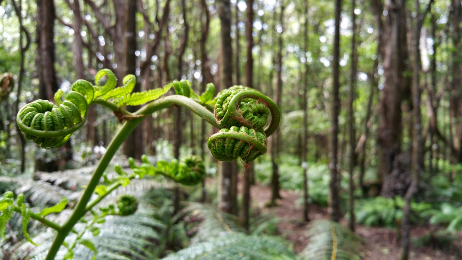
We took a nature trail which was established in 1976, which had a nice informative pamphlet pointing out various sights along the trail. There were tons of different kinds of native ferns in different parts of the forest, some of which were rather pretty:
I even found a single orchid in bloom:
This angle makes it look like the orchid is about to attack me.
All in all it was a nice little jaunt through a native upland forest. There were a variety of other interesting sights along the way (such as a number of invasive strangler figs at various points in their life cycles), but due to the thick foliage they proved difficult to photograph. If you ever get the chance to check it out, I'd definitely suggest it. The one caveat is that we got lucky with clear skies; the Hāmākua coast has some of the highest annual rainfall levels in the state (and the world), due to the humid trade winds blowing in from the northeast and running into Mauna Kea, so it rains pretty often. But if it's not raining, it's a nice place to see some native flora. A hui hou!
Back at the beginning of the month I took a trip up Saddle Road to Pu‘u Huluhulu in order to pick up some cinder for use in my comet-making presentation. Pu‘u Huluhulu is a cinder cone at the base of Mauna Kea, on the Saddle region between it and Mauna Loa (its name means, roughly, “hairy cinder cone” due to the trees growing on it, which contrast with the barren lava fields all around). Here's a shot of me at what I've read used to be a cinder quarry on the west side of the pu‘u.
The day was really overcast and intermittently rainy, so there was a lot of moisture condensed on the foliage. (The white patch behind my head in the picture is actually a bunch of tiny hailstones, which must have happened pretty shortly before I got there.)
Many of the trees that cover Pu‘u Huluhulu (and give it its name) have this really neat looking lichen growing on them. I got some interesting pictures of it with a low depth-of-field:
At the top of the cinder cone is a flat patch, from where you can look out across the Saddle region. This picture looks towards Mauna Kea – if you enlarge it you can see the Mauna Kea access road winding its way up near the center. Fifteen minutes after that picture was taken the clouds descended to completely block that view.
Pu‘u Huluhulu isn't a very large cinder cone, and after half an hour I'd traipsed over most of it and gotten enough pictures to satisfy the artistic urge (most of them weren't really interesting enough to show). It's a pleasant little hike if you ever get the chance – despite being nearly a mile in elevation, it's short enough to keep you from getting too winded while hiking it. A hui hou!
This past week I took part in Journey through the Universe for the second time. Journey through the Universe is an annual event, running for the past eleven years, where astronomers and engineers from the various observatories on Mauna Kea go into classrooms and give talks to the students there. Most of the time these talks include some sort of physical demonstration or hands-on activity. This year I talked about comets, and as part of my talk I created a miniature comet.
Comets are basically, in the immortal words of Fred Whipple, “dirty snowballs.” They are composed of varying amounts of rock, dust, and various ices such as water, carbon dioxide, and ammonia. In preparation for my presentation I did a few test runs of the comet-making recipe I found, including two at work which proved quite popular with my coworkers. I took some pictures of the process (though in poor light, unfortunately) and thought I'd share them here.
We start with a plastic garbage bag inside a large plastic mixing bowl. (When dealing with dry ice, you really want to keep it away from metal as the extremely fast cooling of the metal causes it to emit nails-on-a-chalkboard-level screeches.)
Next, we add some dirt and stir it in.
Then, we add a dash of ammonia and some corn syrup, to represent the assorted organic molecules detected in comets. Organic, in this context, is used in the chemistry sense, meaning “a molecule containing carbon.”
Now, we crush up two cups of dry ice by pounding it with a meat tenderizer, add it to the dirty water, and stir vigorously. This produces an impressive amount of fog, making it hard to see what's happening, but you can feel the ice start to freeze up pretty quickly.
When it's mostly frozen, you can pick up the bag and form the comet like a snowball (something I have basically zero experience doing, I should note). When that's done, we've got a comet!
(Man, that light is poor.)
I don't usually take pictures of myself, so this actually took quite a bit of practice, and I got a bunch of melting dirty comet-water on my hand and a cramp in my leg in the process. Here's a close-up look at the comet:
This comet may actually be the best one I've made so far. I initially thought some of the chunks of dry ice were too big, but thinking about it now I think that may actually be a good representation of real comets. After making the comet I stuck it in a pan in front of me on my computer desk and watched it as it melted over the course of a few hours. This last picture was taken about half an hour after making the comet, and show pits where the water ice froze around some dry ice which has now melted, leaving a pitted surface.
This is quite a fun project to do. The part where you mix the dry ice and water is especially visually impressive, and quite popular with bystanders. You'll most likely have dry ice leftover, too, so you can have more fun with it after the fascination of watching a comet melt has worn off. A hui hou!
Yesterday, February 28th, marked my last day as an employee of the Joint Astronomy Centre. Come today I've been officially terminated from my position there and become an official employee of the East Asian Observatory. It's somewhat of an historic occasion; it marks only the second time a world-class observatory has been transferred from one owner to another.
The first was UKIRT back in October, but that involved only five staff members and transfer to two organizations that have both been around for a while (the University of Arizona and Lockheed-Martin). This time there are over thirty of us involved, being transferred to a new organization formally created just last year.
As you might imagine, transferring operations from an organization with over thirty years of history to one with just a few months' worth is a tricky process. We've dealt with all kinds of transfer-related issues in the last few months, and will undoubtedly have more that pop up Monday morning, but the tenacity that led us to stick with the telescope instead of finding different jobs will no doubt see us through. Exciting times, to be sure!
Next week I'm taking part in the Journey through the Universe program again, where I'll being visiting classrooms in Hilo and giving a talk about astronomy. The project I picked this year is quite visually impressive, and I've got some pictures of a test run I did so expect to see those up here pretty soon. A hui hou!
This post is either a little late or a little early, depending on your perspective. The piece of news I wanted to point out is that Inkscape, the free and open-source vector image editing program, has recently had an updated version released. If you read this blog you'll have seen images made using Inkscape, as I use it frequently (the image in the previous post, for instance, was made with the previous version of Inkscape).
Why is this big enough news for me to want to post it, you ask? This particular update is both large, and a long time in coming. Like, almost four-and-a-half years in coming. The version number jumped from 0.48.5 all the way to 0.91! This long period of development apparently resulted in over 700 bugs being fixed, and the addition of a new internal rendering engine which should bring some performance enhancements. There are a whole host of other little improvements and additions, which are better explained in the official release notification.
I mentioned this post could be considered both early and late; it's late, because the new version was actually released at the end of January, but I only learned of it at the end of last week. It's also somewhat early because I haven't actually had a chance to use the new Inkscape version yet; I'm waiting for the packages to be made available for Debian (which Linux Mint Debian Edition uses). It's currently available for Windows, Mac, Ubuntu, and OpenSUSE, though, and I'm sure I'll get to play around with it soon enough. If you're looking for a good vector graphics program, I encourage you to give it a try! And if you aren't, take a look at it anyway; you just might find it to be the solution to problems you didn't know you had. A hui hou!
Every first-year astronomy student at some point runs up against the sequence of letters “OBAFGKM.” (Remembered with the help of the catchy mnemonic “Oh Be A Fine Girl/Guy, Kiss Me.”) All stars are classified according to their spectra and classified with one of these letters, along with some additional information for further granularity. It brings up the question, though: where did this opaque string of letters come from in the first place?
To understand the origin of our modern classification system, we must go back to the very first attempts to construct such a scheme based on the then-novel discipline of spectroscopy. Spectroscopy, as a reminder, is the measurement of an object's spectrum, the chemical fingerprint of an object woven into the colors of the rainbow; it encodes all kinds of valuable information about the object's chemical and physical properties.
Back in the 1860s and ‘70s, an Italian priest and astronomer by the name of Angelo Secchi was one of the first to apply spectroscopy to the stars. He divided stars into five categories based on their spectra. These classes were mostly arbitrary and have since been superseded, but they were an important first step in the process.
In the 1880s, the American astronomy Edward C. Pickering was compiling a catalog of stellar spectra, which resulted in the Draper Catalogue of Stellar Spectra. His assistant the Scottish astronomer Williamina Fleming divided Secchi's five classes into more specific classes with letter headings running from A to N, with a few more for unusual spectra. These categories were based on the strength of the absorption lines of hydrogen; category A had the strongest lines, then B, and so on. This is an arbitrary choice, though a reasonable one, given that hydrogen makes up 70% of the matter in the universe.
This stood until 1901, when Annie Jump Cannon, an American astronomer, rearranged the lettered categories and dropped all the letters except O, B, A, F, G, K, and M. (She also came up with the famous mnemonic in the opening paragraph.) This re-sequencing of the letter categories worked because it followed what the spectra were doing – a sequence of spectra according to Williamina's original scheme of A–N would result in the hydrogen absorption lines smoothly varying from bright to faint, but other spectral lines wouldn't necessarily follow a specific pattern. With Annie's re-organization, all the lines would vary smoothly (at least, more smoothly), although the theoretical work necessary to explain this wouldn't be fully completed until the 1920s.
[Edit 2/24/19: I've since realized that this should all be discussing absorption lines rather than emission lines as I originally put since that's what we actually see in stellar spectra. For this demonstration, at least, the idea of varying strengths still works, just realize that it's backwards from reality and when I'm talking about emission being bright/faint it should really be absorption being strong/weak.]
Below, I've made a picture to help illustrate. In this picture we have some extremely stylized spectra, with a few fictitious emission lines at various wavelengths. For the purpose of this picture, hydrogen is the emission line in the yellow part of the spectrum (although in reality hydrogen has one red line and several blue ones as seen in the Balmer Series). The left side has the spectra organized according to Williamina's original sequence, while the right side has Annie's re-organized sequence. If you watch the yellow line on the left side of the graph you'll see it smoothly varying from bright to faint as you go down. On the right, all the lines are smoothly varying, but not just from bright to faint; some go from faint to bright, while others go up and then back down.
Spectra fit nicely into Annie's scheme, but it wasn't apparent why until the Indian physicist Meghnad Saha derived a theory of ionization in the 1920s which the British-American astronomer and astrophysicist Cecilia Payne-Gaposchkin used in her doctoral dissertation to show that the sequence of spectra was actually a sequence of surface temperature. (This has been called “the most important dissertation in the history of astronomy.”) O-type stars have the hottest surface temperatures, while M-type stars have the coolest (our Sun is a G-type star, for reference).
This is an important point, and one that requires quantum mechanics to appreciate fully. Atoms emit photons of light when electrons in them drop down from a high-energy state to a low-energy state, the exact states determining the wavelength (or color) of the light. Without an external source of energy, electrons will sit around in the lowest energy state they can reach; the continuing emission of light from stars comes from the heat of the star constantly exciting electrons into higher-energy states.
Pivotally, the efficiency of this process depends on the exact temperature. Put simply, too cold and the atoms of a given element (hydrogen, for this example) won't get excited very often and thus won't put out too much light. Raise the temperature and you should get more and more excitation and the brighter light, right? This is true, but only up to a point. Once a certain key temperature is reached the emission of light will actually begin to drop off again. The reason for this is that higher temperatures actually make the electrons too excited to drop down to lower-energy states easily (or at least, make the transitions that correspond to visible light; in reality, they'll be making other transitions that correspond to non-visible light).
It turns out that A-type stars are ones where the temperature is just right for exciting hydrogen, thus giving them the brightest hydrogen lines. As you go away from A-class the strength of the hydrogen lines drop off as the stars become either too hot or too cold. And that's where that odd sequence of letters comes from!
Addendum: In reality, there's a bit more to classifying spectra than just these letters. In practice each letter class is split into ten subclasses using the Arabic numerals 0–9 (a practice also started by Annie Jump Cannon), and also a luminosity class denoted by either Roman numerals or additional letters for special cases. For instance, our Sun is classified as G2V, indicating a main-sequence star with a surface temperature of about 5,800 K.