Sunday, September 27, 2015

Rocks in Space: Finding Asteroids in the Solar System

I came across a neat video on YouTube the other day, showing visually the discovery of all the asteroids found since 1970 up to the present.


In this video the Sun is at the center, with the inner planets (and occasionally Jupiter) seen rotating around it from a position above the plane of the solar system (so looking down on the Earth's North Pole). The planets aren't labeled, but it's easy to count outwards from the Sun to find Earth. At the start of the video in 1970 all of the 4,422 asteroids known at that point are marked with tiny dots. (It's best to watch on the highest resolution you can, otherwise they're hard to see.) As time unfolds, asteroid discoveries are marked with bright white dots, before fading to a fainter color. Yellow and red dots (I'm guessing) are asteroids that come close to Earth, or Near-Earth Objects (NEOs).

Later in the video you might notice asteroids in the same orbit as Jupiter. These are known as the Trojan asteroids. These asteroids orbit the Sun in roughly the same orbit as Jupiter, but 60° either ahead or behind of it. The name comes from the fact that early on the first few discovered were given names from the Trojan War (starting with 588 Achilles), and it was proposed to continue with the naming scheme and give them all such names. The naming scheme even extends to location: asteroids ahead of Jupiter are given names from the Greek side of the war, while those trailing it are given names from the Trojan side. (Though amusingly, there are two out-of-place names from before this particular convention was adopted: Patroclus is found among the Trojans, and Hektor among the Greeks.)

The term Trojan asteroid originally referred to just the asteroids in the orbit of Jupiter, but when other asteroids sharing similar orbits with other planets were found the term expanded to encompass them as well. Currently Trojan asteroids are known for Earth (1), Mars (7), Jupiter (6,000+), Uranus (1), and Neptune (13).

As for why Trojan asteroids are generally found around 60° in front of or behind the planets they share an orbit with, that has to do with gravity, the three-body problem, and Lagrange points, and really deserves a blog post to itself sometime.

And finally, while watching these nifty visualizations, just keep in mind the fact that sizes are not to scale. In reality, while it looks like the asteroid belt is a swirling maelstrom of space debris, there are typically millions of miles (or kilometers!) between any two asteroids. There may be a lot of rocks out there, but there's an even larger volume of space to hold them. A hui hou!

Monday, September 14, 2015

Saturn's Rings and the Earth-Moon Distance

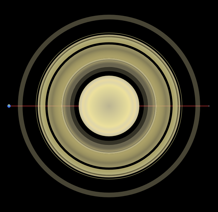
A few weeks ago I happened to hear offhand that Saturn and its rings would fit nicely in the space between the Earth and Moon. Being the visual-oriented person I am, I decided to go ahead and make a picture to put them in perspective, and figured I'd share.

First of all, a quick primer on the nomenclature of Saturn's rings. The rings are labeled alphabetically in order of discovery, although the A, B, and C rings were all discovered basically at the same time and the decision to name them working outward in towards the planet was pretty much arbitrary.


Technically the F ring is too thin to be shown here; it's only about 30–500 km thick which means it's about 40–400 times thinner than shown here. The relative brightnesses of the rings is also only approximate; the G ring (and even D ring) are also fainter than shown here, and aren't visible to the naked eye. They were only discovered with photography from various interplanetary probes after 1979 (as was the F ring). The F ring is the outermost of the “discrete” rings; beyond it, the rings are diffuse and may have moons orbiting embedded within them.

The astute among you might have noticed that there is a distinct lack of an E ring in the above image. Don't worry, we'll come back to that. Anyway, let's see how these rings stack up against the average Earth-Moon distance:


With an average separation distance between them of about 358,000 km, we can see that the Earth and the Moon nicely frame Saturn and its main rings there. It also gives a good idea of the size of Saturn relative to Earth.

But what about that E ring I glossed over a paragraph ago? Turns out the E ring is outside the G ring and extremely large, but like the G ring it's also extremely faint and diffuse.

Anyway, here's the E ring in all its glory (I've left the Earth, Moon, and the line between them in place):


Yeah, the E ring's pretty wide (and again, it's so diffuse that it's not visible to the naked eye). Its outer edge is just within the orbit of Saturn's largest moon, Titan. As you can see (or maybe not), the E ring's diameter is around twice as large as the average Earth-Moon distance.

But believe it or not, that's not all of Saturn's rings! There are a few more ringlets between the G and E ring that are too thin to show here, but there's another ring outside the E ring that's even larger and even more diffuse. This ring was only discovered in October 2009, and is known as the Phoebe ring after Saturn's unusual moon Phoebe which orbits just outside of it in a retrograde orbit. Here it is, with the rest of the ring system for comparison:


Yep, that little disc in the center is the E ring we just saw in the last picture—with the inner ring system and Saturn within that. This ring is really large. In fact, unlike the other rings which have a maximum thickness on the order of tens to maybe hundreds of meters, the Phoebe ring has a thickness around forty times greater than the radius of Saturn itself. In other words, this ring is thicker than the entire diameter of the E ring.

So there you have it! Saturn and its fascinating ring system, and how it compares to the distance between the Earth and the Moon. Hope you found it as interesting as I did putting these images together. A hui hou!

Sunday, August 30, 2015

A Couple Panoramas of the Oregon Coast

While attending the family reunion I was on vacation for in Oregon in July I got the chance to take a trip up the Oregon coast. There's some really gorgeous scenery up there, and I took the opportunity to take some pictures for panoramas. I finally got around to putting them together this weekend and thought I'd share them.

First off here's a panorama of Simpson Reef, a small reef off the Oregon coast.

Edit (3/19/18): This panorama now is the version made using Hugin, but you can mouse over it to see the original version!

Mouse over for original, click for larger version.
The largest island visible near the center of the image is Shell Island, and while you can't see it at this resolution the beach at its base was absolutely covered in sea lions. From my location at the overlook spot I could hear a constant faint cacophony of cries from the mass of pinnipeds sunning themselves on the strand. The reef is part of the Oregon Islands National Wildlife Refuge and Oregon Islands Wilderness, and its constituent islands are also important breeding grounds for lots of seabirds.

This panorama isn't of anywhere particular (it's just a bit up the coast from Shore Acres State Park), but I loved the landscape.

Edit (3/19/18): Again, this is the new version made with Hugin, mouse over it to see the original hand-made one!

Mouse over for original, click for larger version.
It's hard to see at this resolution, but there are some neat concretions visible down close to the shoreline. Concretions are masses of matter harder than the surrounding sedimentary layers formed by precipitations of mineral cement, and look like roughly spherical lumps protruding from the softer stone around them as it erodes faster. The whole coastline here shows some interesting weathering and erosion features.

It occurred to me while making these panoramas just how much work goes into making them, and I'm considering possibly doing a little walkthrough/tutorial on what I do to put these together in the future. Anyway, enjoy the landscapes. A hui hou!

Saturday, August 22, 2015

Ice Skating in Hawaii

It's been a little bit quiet around here as I spent pretty much the last two weeks of July and the first week of August away, first back on the west coast for a family reunion then in Honolulu for a business trip. The triennial IAU (International Astronomical Union) conference was back in the U.S. for the first time in twenty-five years, and as a new organization EAO wanted to have a booth there to help get our name out. Which is why I got to spend a fun week in Honolulu talking to people about the JCMT!

Despite flying through the Honolulu airport twice a year on average for the past six years this was my first time actually outside the airport. It was a bit of a shock just how different it was from Hilo. O‘ahu has a lot of basically flat area, something that is in short supply on Hawai‘i, and it was discombobulating to drive for miles with essentially no elevation change. Though the half-mile walk to the convention center from my hotel was flat rather than uphill, so I'm not complaining.

Check out our nifty booth!


That fantastic diorama of the summit of Mauna Kea on the left there belongs to Subaru with whom we were sharing a booth, and boy, was it popular throughout the conference. It was really nice to be able to point out to people exactly where the JCMT (and everything else) on the summit was.

While I was there, I got to do something most people don't associate with Hawaii: ice skating! My co-worker and friend from college that I went over with, Will, suggested it, so one night after the convention was over we took the bus over the skating rink. I even took a really poor picture as proof!


Yeah, that picture didn't really come out well. I blame my slightly deranged expression on the fact that I was standing on ice skates and concentrating on not falling over. It was a lot of work, and there was much comedic flailing as I rounded the rink a few times, but at least I managed not to fall down over the course of the hour I spent on the ice. All in all, a fun experience. Look forward to some pictures from my time in Oregon soon!

Saturday, August 8, 2015

Adding Cubits to your Lifespan

In my Bible-reading this morning I ran across Matthew 6:27 where Jesus says “And who of you by worrying can add a single πῆχυν to his ἡλικίαν?” This is an interesting verse to translate, because ἡλικίαν (pronounced heylikian, with the i's sounding like the i in machine) is usually translated as something like ‘lifespan,’ but πῆχυν (pronounced peychoon, where the ‘ch’ sounds like it does in German ‘Bach’ or Scottish ‘loch’) is a very straightforward word meaning ‘cubit.’

On the face of it, this doesn't make grammatical sense; how do you add a cubit to your lifespan? This has lead to two divergent translations I've seen: one involves translating πῆχυν as ‘hour’ (despite there being another definite word for hour, ὥρα [hora]), while the other translates ἡλικίαν as ‘height.’

Neither of these translations sound really good to my ear, so I when I came to the passage this morning I decided to go back to the literal meaning of both words and incorporate insights from relativity theory. Relativity tells us that time is simply another dimension like the three dimensions of space (which are inextricably linked in a four-dimensional spacetime), and that by using the speed of light as a conversion factor we can use units of measurement for space to measure time, and vice versa. What does a ‘second of distance’ mean? It's the distance light travels in one seconds, approximately 186,000 miles or 300,000 kilometers. And similarly, one ‘meter of time’ is the amount of time it takes light to travel one meter, approximately three nanoseconds.

A cubit, by the way, is very close to half a meter, so what Jesus is basically saying here is that you can't add even a nanosecond and a half to your life by worrying—so don't worry, because your Heavenly Father is in control. A hui hou!

Sunday, July 26, 2015

Diagramming Noun Adjunct-Heavy Sentences


I learned to diagram sentences from my mother (a Linguistics major in college), but didn't appreciate it much at the time (to be fair, my mother didn't appreciate it either until she began teaching me and my sister). Until, that is, I ran across a sentence in the local newspaper that made me want to diagram it.

The sentence in question was “This is not an administrative license revocation matter.” (It has to do with the ongoing investigation into whether the mayor of Hilo inappropriately used government funds for personal benefit.) It's not particularly long—no complicated compound sentence or anything—it was merely the noun phrase in the predicate that attracted me. It took me quite a bit of research, though, to figure out what all those nouns near the end are.

The ending noun phrase “administrative license revocation matter” has what looks like a couple of nested noun adjuncts, which is where a noun modifies another noun the way an adjective normally would. “Administrative” is an adjective modifying “license,” which is itself serving as a noun adjunct modifying “revocation,” which entire phrase is modifying “matter” at the end.

And yet, nowhere could I find how to diagram something like that. One website helpfully told me that noun adjuncts are diagrammed like adjectives—on a diagonal line beneath the noun they modify—but I couldn't see any way to chain multiple noun adjuncts together.

After some time pondering the matter and scratching my head, I decided to pull a mathematician trick reformulate the sentence into something with a prepositional phrase: “This is not a matter of administrative license revocation.” Written this way, I can just about diagram it, though I'm not 100% sure about “administrative.” I ended up diagramming it as you would an adverb modifying an adjective because it looked nice and seemed similar, but I've no idea if that's correct. Anyway, here's what I eventually ended up with:


If any of you out there are more familiar with sentence diagramming and would like to point out how it should actually be done, feel free to sound off in the comments! A hui hou!

Wednesday, July 15, 2015

Why New Horizons Can See Pluto, and Hubble Can't

About a day ago the New Horizons space probe finally reached the end of its nine-year journey through space and accomplished its mission: a fly-by of Pluto, marking the first time humanity has gotten to see the surface of this mysterious minor planet.

And what a surface it is!

Pluto, as imaged by New Horizons. Credit: NASA/JHUAPL/SWRI
Just look at all those surface features! There's a large icy vaguely heart-shaped region in the middle (which reminds me of Antarctica for some reason). It's flanked on two sides by extremely dark patches. On the right side of the picture long shadows betray the presence of fierce mountain ranges jutting from the smooth plains around them. What looks like a long canyon sits on the left side of the image, while vast smooth plains fill the top half. Speaking of which, there's a noticeable dearth of obvious impact craters—I can spot a few, but it's nothing like, say, Mercury, or our Moon.

When I was growing up in the 90's, from as early as I could remember I was fascinated by other planets. This was the beginning of my lifelong journey to become an astronomer, as I devoured every bit of reading material I could get my hands on pertaining to the solar system. This was right after the two Voyager probes had completed their missions to the outer planets (Voyager 2 flew by Neptune the year I was born, 1989), so there was an eclectic mixture of information in the books I read, depending on how old they were and how up-to-date their information was. (Looking back, I realize this was excellent training for my young self in sifting multiple conflicting sources of information and piecing together a coherent narrative from them. Huh.)

The newer books had pictures of the outer planets and their moons from the Voyager probes that were of resoundingly better quality than the ones before it. Those two probes taught us so much about the planets that we simply couldn't see from our vantage point on Earth. The point to this rather rambling divergence is that I know now what people must have felt like when those first pictures of each new planet were coming back. If you're not familiar with our previous best images of Pluto, let me show you one (courtesy of the Hubble Space Telescope):

Credit: NASA/STScI
To be clear, the actual photos of Pluto are those two small pictures at the top; the larger ones are computer models extrapolating from those pictures. These were among the best images of Pluto we had until yesterday. And yes, that's a photo from 1996, but we didn't really get any better ones in the intervening time period; here's another one from 2012:

Credit: NASA/STScI
The letters WFC3 at the top of this image stand for Wide Field Camera 3, the last and most technologically advanced camera installed on the Hubble Space Telescope, so this is as good it's possible for Hubble to get. With that in mind it's easier to appreciate just how amazing the pictures from New Horizons are.

“But hang on,” you may be saying, “why can't Hubble get better pictures of Pluto? It gets all those amazing pictures of galaxies, and they're a lot further away than Pluto is!”

If you're asking this, then you're in luck, because I asked myself the same thing driving home from work today. The apparent discrepancy comes about due to us humans not having a good intuitive sense about sizes and distances so far outside our everyday experiences. To really get a feel for why things are the way they are, we need to use math.

My idea for this was find the diameters and distances to Pluto and a nice galaxy that Hubble had photographed, take their ratios, and see just how much bigger the galaxy would appear on the sky. Then while researching these bits of information in order to write this post I discovered that an astronomer named Emily Lakdawalla had already done exactly that. So rather than write up another post that would say pretty much the exact same thing, you get to go read her blog post. (She also already has an excellent image showing the relative sizes of a lot of Pluto-sized bodies in the solar system using the newest images of Pluto and Charon!)

I had an idea to take a picture of a galaxy and a picture of Pluto and shrink the Pluto picture down and stick it on the galaxy picture to see how they compare, but I did a quick back-of-the-envelope calculation with a galaxy picture I picked out and discovered that Pluto would be about two pixels across (which agrees quite well with the conclusion in Emily's blog post that Pluto would theoretically cover less than two pixels of Hubble's WFC3). I tried sticking a little 2×2 bright green square into the image, and could barely make it out at 100% resolution even knowing where to look. So I figured it wouldn't be especially interesting to show given that putting the picture up on this blog would further shrink it. Sorry.

But to come back to the point I was trying to convey originally, this is a historic day (well, yesterday technically) for planetary science, unmanned space probes, and Pluto. If you come across any of the doubtlessly many more images to come back from New Horizons I hope you now better appreciate them for just what a huge leap forward they represent for our understanding of this fascinating little ice-and-rock-ball out on the outskirts of our solar system. A hui hou!

P.S. Also, New Horizons' mission isn't quite as over as made it sound in the opening sentence. It will continue to observe Pluto and its moons for about another month or so as it whips on past, and will probably continue to send back observations about anything else it can see way out there for a long time to come after that. Exciting!

Monday, July 13, 2015

Close Encounters with the Katydid Kind

Today at work, during our morning tea time, I spotted something in the hall which at first glance I somehow thought was a giant green spider, but which on a second look turned out to be a fairly normal-sized katydid.

This katydid, in fact. Let's call her “Katy” for simplicity. That's my arm, for scale.

I've never seen a katydid here in Hawaii before, so I had to check with my co-workers that it wasn't some invasive species that should be killed on sight. Once I'd ascertained that it was not, I undertook to return “Katy” to the outdoors. I don't really have any experience with katydids; I only really know what to expect from their relatives, grasshoppers and crickets. I wasn't sure if she would prove flighty and try to jump away, so I very carefully and slowly put one hand in front and one hand behind her to see if I could carry her out slowly without the entire affair devolving into me frantically trying to catch her as she hopped equally frantically away.

To my surprise, she took a calculating look at my approaching hand and calmly and sedately climbed aboard with basically no encouragement on my part. Katydids are herbivorous and harmless to humans, so while she was on my hand and so obligingly demure I took the chance to study her up close as I took her back through the break room (and my coworkers there) on my way outside.

Katy seemed to be about as interested in me as I was in her, returning my curious stare with a frank and thoughtful one. She looked as if she were mulling something over as her miniature mouth parts and antennae slowly waved to and fro. Thus I was caught completely unprepared when she suddenly leaped directly at my face!

I'm pretty sure I let out a startled squawk – I know I jumped, to the great amusement of my coworkers I'm sure. My eyes had reflexively slammed shut due to, y'know, something jumping at my face, and as I carefully pried them open again it was to find Katy calmly hanging out on my nose.

Now, if you read this blog you're probably aware that I don't take pictures of myself lightly or often, but I couldn't pass up the golden opportunity to see what I looked like with a katydid on my nose. To my great sorrow, while I was pulling out my camera Katy decided she didn't like my nose after all and jumped down onto my arm, where I had to be content with the picture above. After a few more pictures (most of poor quality sadly) I took her outside and let her off on one of bushes near the door.

Katy, back in her natural habitat.
All in all, it was fun. It's not everyday you get startled half to death at an office job by the insect equivalent of a cow, after all. A hui hou!

Tuesday, June 30, 2015

Belated Tau Day

I realize I missed it by two days, but happy belated Tau Day everyone! What's Tau Day, you ask? It's like Pi Day (3/14), but for Tau (6/28). "But what's tau," you're probably asking.

Simply put, tau is twice pi, or \(\tau=2\pi\). Like pi, tau is irrational and transcendental. But what's so special about \(2\pi\)? Why not \(3\pi\), or \(4\pi\), or any other integer multiple?

The reason has to do with circles, geometry, and the ancient Greeks. Everyone who's taken geometry is familiar with the formula for the circumference of a circle, \(C=2\pi r\), where C is the circumference and r is the radius. This, however, is the modern formulation. The ancient Greek geometers who first came up with the concept were thinking in slightly different terms: namely, that two times the radius of a circle equals its diameter. Thus, to them, the formula would be expressed as \(C=\pi d\) where d is the diameter (\(d=2r\)).

That formulation looks nice and compact, just four symbols total (although that itself is a modern artifact, as symbolic algebra as we know it wasn't invented until the Middle Ages). However, it's not quite as fundamental as it could be, because the diameter of a circle is a less fundamental concept than its radius. A circle can be—indeed is—defined as the set of all points whose distance from a single central point is exactly equal to the radius. There's no such simple way to define a circle using a diameter other than to cut it in two and use the radius anyway. Hence, the modern formulation uses radius rather than diameter.

Unfortunately, using the radius introduces that factor of two into the picture. You see, the modern formulation goes only halfway. The ancient Greeks liked their version because it was clean and simple: take any line segment to be the diameter of a circle, multiply it by this one single, simple constant (\(\pi\)), and boom, you have the circumference. And you can see the simplicity there that all mathematicians strive for.

So let's say we want to remake the modern formulation to get rid of that ugly extra 2 in there. We can simply multiply pi by it and get tau, to make our new formula \(C=\tau r\). It's simple, elegant, and—importantly—more fundamental than using pi. Take any line segment as the radius of a circle, multiply by tau, and bam—you've got your circumference.

Pi was a good first attempt at getting a very important number in math and physics, the circle constant that shows up everywhere cyclical processes are involved. It's just the wrong constant. It's the ratio of the circumference to the diameter, when the more fundamental constant is the ratio of the circumference to the radius—tau.

It's getting late and I should wrap this post up, so I will end by providing a link to The Tau Manifesto for anyone who's still interested. It's where I first encountered the idea of using tau instead of pi, and shows in detail how tau simply makes more sense to use in many areas of math and physics. I was reflexively against the idea when I first read it, but over time I've come to see how much sense it makes—to the point I'm even writing about it here on my blog. Funny how these things happen. A hui hou!

Wednesday, June 17, 2015

Panorama Extravaganza

In my outings and explorations, I often find myself drawn to taking pictures with an eye to stitching them together into a panorama after getting home. I don't know why; I never really set out with the intention of making one, the muse just comes sometimes. The problem is that after spending time carefully hand-stitching the resulting panorama together and admiring the result they go off to live on my hard drive because it's hard to find a good way to show an image that's much wider than it is tall.

Last year I realized that with my dual-monitor setup I actually have a pretty good way to display some of my panoramas: as wallpaper for my 3,840-by-1,200 desktop. I created a wallpaper from some pictures of Polulū Valley which has adorned my desktop until today. However, I didn't get around to making more wallpapers from my old panoramas until today when I went through and created a few more from those that would stand it, then took pictures of them so I can show them off.

My Pololū Valley wallpaper.
Some panoramas just didn't work, being much too wide (although I just realized I could probably cut those into pieces and make wallpapers from them). None of them fit perfectly, of course, and all required a little cropping, but I found another four that were close enough in aspect ratio to make work with minimal cropping.


A lovely view from Laupāhoehoe Point. I love the dynamism of the waves coming in and the poignantly deep sapphire blue of the ocean.


A beautiful sunset from Pu‘u Kalepeamoa, near Hale Pōhaku, with Mauna Loa (left) and Hualalai (just visible through the clouds right of the sun).


A tranquil vista of Lake Waiau (minus the northernmost bit). This is the wallpaper I have right now, as it's just so...irenic. Idyllic, even.

I was a bit surprised to find that some of my older panoramas were actually too small to be made a proper wallpaper at this resolution, as they were too short either vertically or horizontally. I used to take photos with smaller resolutions back before I had a terabyte of hard drive space to store them on, and it definitely shows (my lovely Crater Lake panorama wasn't wide enough to cover both screens). I was equally surprised to find one of my oldest panoramas was big enough to use:


This panorama, from sometime early 2008, is a not-particularly clear shot of the lower tall of Tall El-Hammam, an archaeological site in Jordan north-east of the Dead Sea that I had the pleasure of excavating at for parts of two seasons in 2007 and 2008. It's beyond doubt the site of Sodom from the Early Bronze through Middle Bronze periods, then several other cities through Iron, Roman, and (I think) even Byzantine periods (it may be the site of the Roman-period city Livias, mentioned in texts, but whose location was otherwise unknown). As you can see, the soil in the plain of the Jordan down in the Dead Sea Valley is quite fertile and the lower tall had a lot of crops being grown on it at that time. I know they've excavating quite a lot in the lower tall in the years since I went so I don't know what it looks like now, though I hear this coming season (next January) they'll be going back to the upper tall where I dug and where this panorama was taken from.

It's so nice to finally have a place to show off my panoramas rather than letting them languish on my hard drive, and I hope you enjoyed seeing so many in one post. A hui hou!